MEROIR + OYSTER BAR
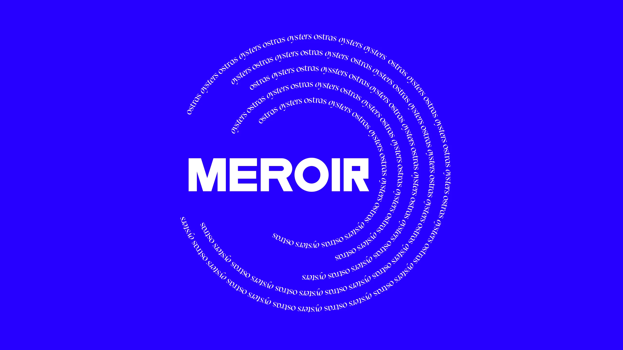
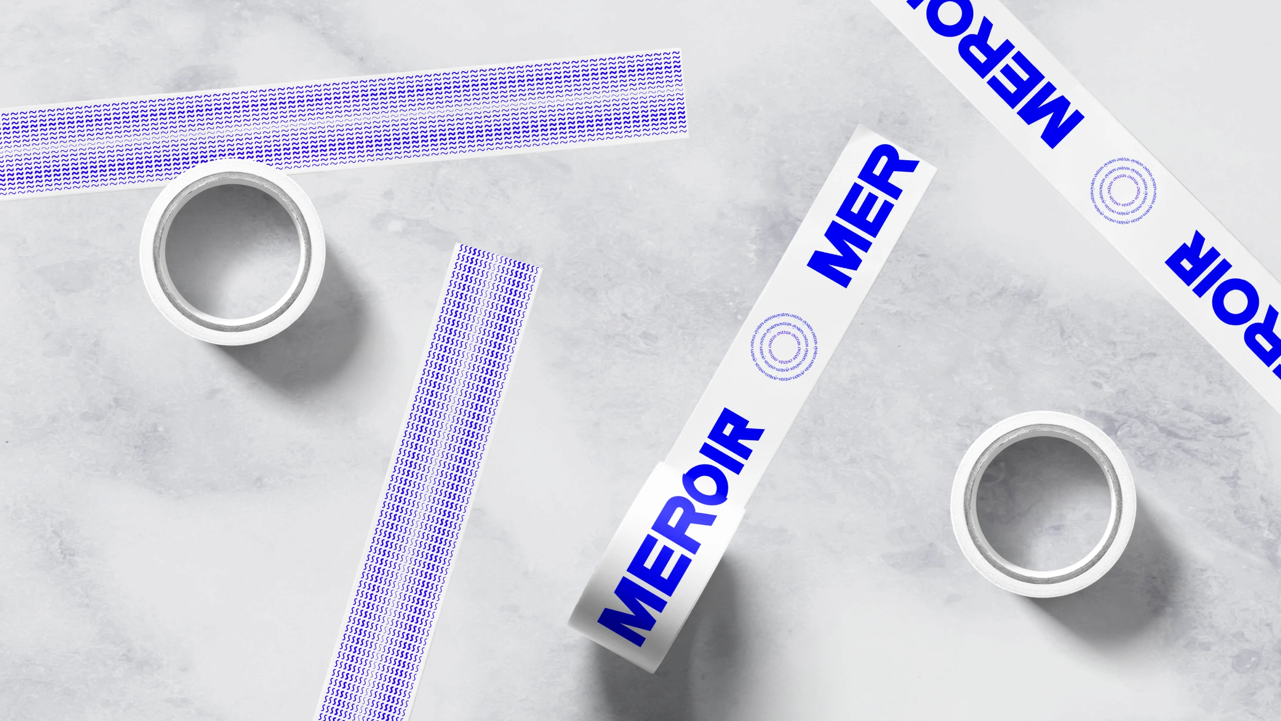
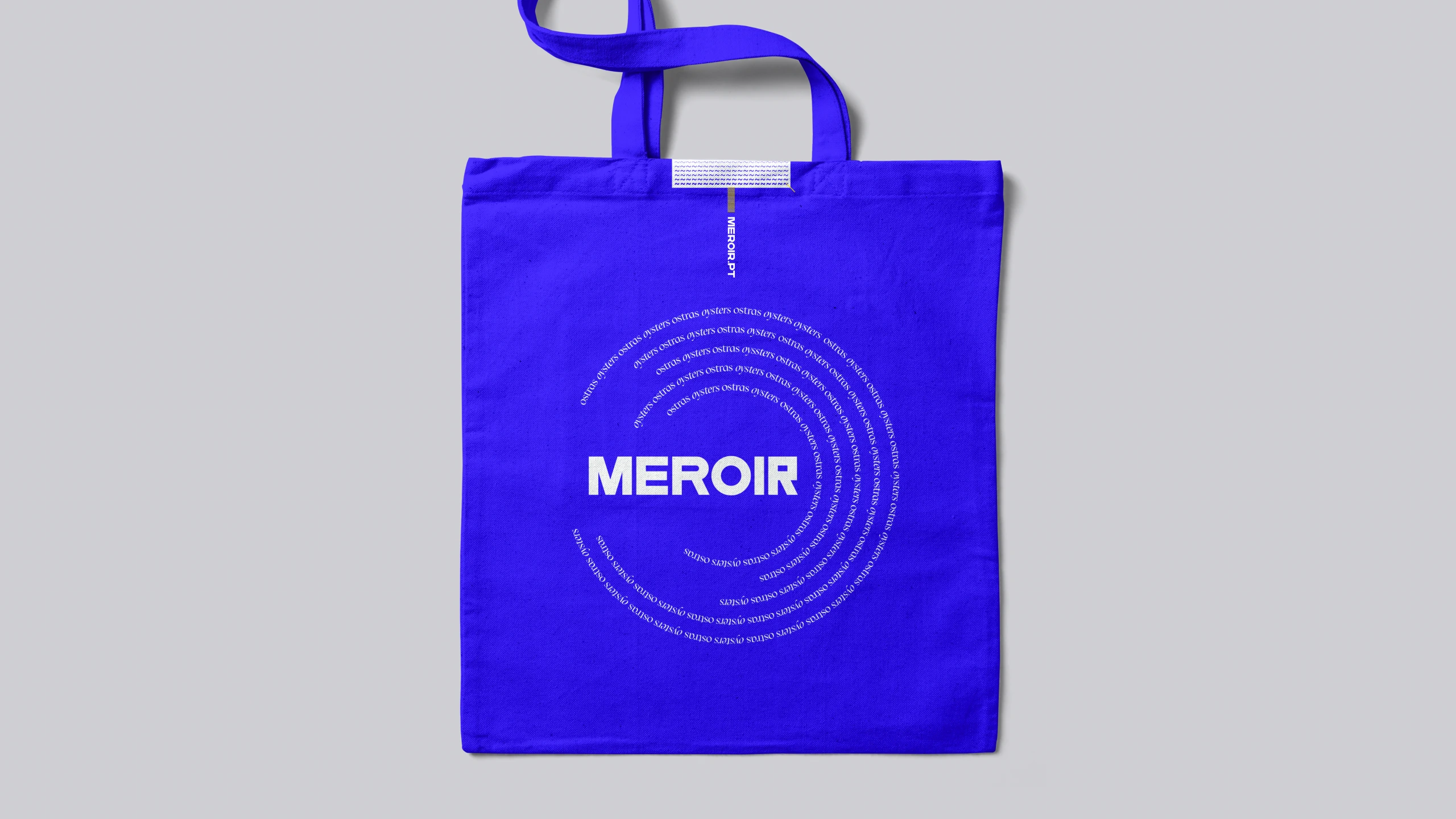
A visual identity for a restaurant and oyster bar.
The idea was to create a brand design system inspired as much in the product environment (oyster), with a lot of layers and angular shapes.
The photography is inspired by the nature and gives the ability to create a great contrast with the color palette frames blue and yellow (sea and sun).
The goal is to communicate a more casual and trendy tone for the brand, without compromising the quality of the product.
Because no, oysters aren’t always the same.


